Sara Cannon is an artist, designer, creative thinker, business owner, developer, and dreamer. She’s a Partner and the Creative Director at Range: a Design and Development Agency specializing in WordPress.
In the beginning
In 2004, Sara was a design student in college when she was searching for a CMS to use for an organisation she supports.
I put them on Joomla and thought “surely there is another option out there.” I stumbled upon WordPress and have been hooked ever since.
Since then she’s contributed to core, organised WordCamps and Meetups, and co-founded a WordPress business:
WordPress and the WordPress community is such a huge part of my life. I can’t imagine what I would be doing without it. #CheersToTheGPL
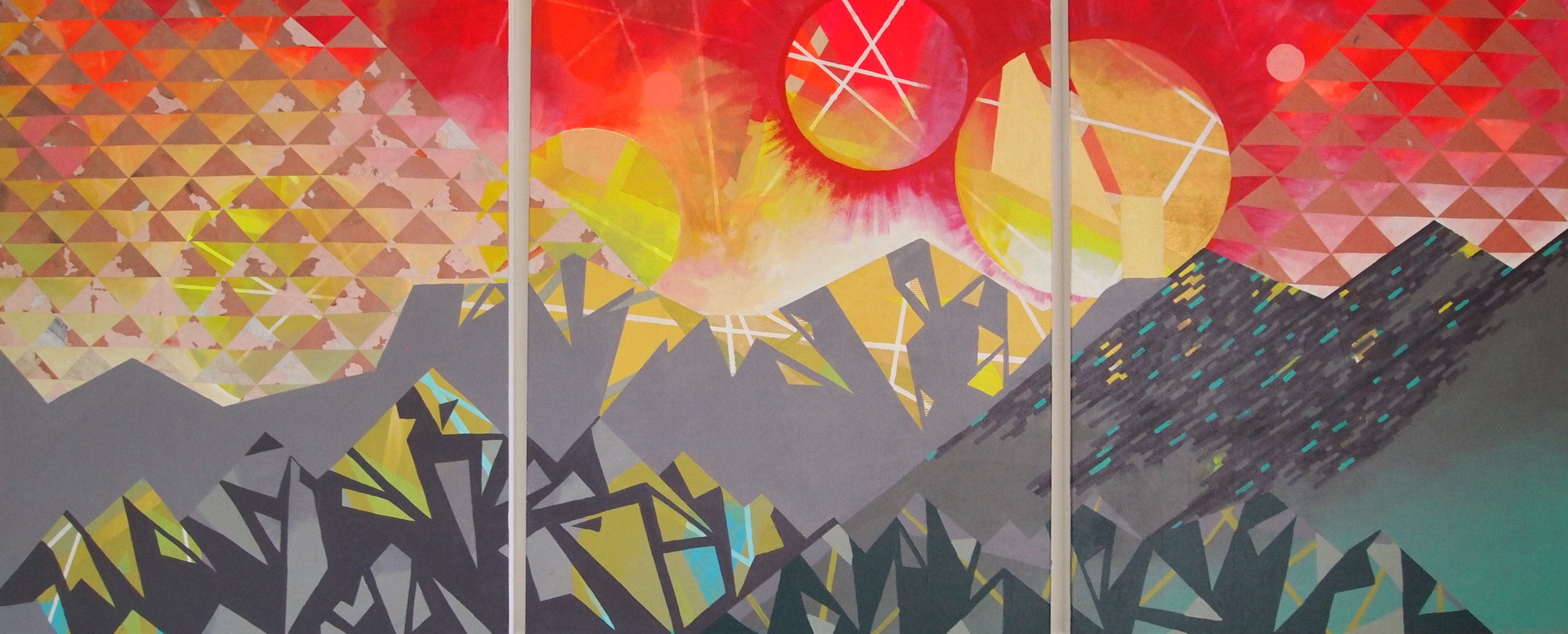
As well as being a designer, Sara is a talented artist. Her work, at saracannonart.com is based on the intersection of organic shapes, geometry, and landscapes:
I thoroughly enjoy making art and believe that the exploration of form and imagery in a different medium makes be a better designer. I really enjoy exploring stimulating geometric patterns and bright whimsical imagery.
Sara at WordCamps
Sara is a WordCamp regular. In the past she’s been an organiser of WordCamp Birmingham. She’s attended 4 WordCamp San Franciscos alone, and spoke at two of them. “One of my favorite memories is hosting a launch party for Range in 2012 and inviting all of our close friends in the community (our WordPress family) to come and celebrate the new beginning with us.”
Sara’s first WordCamp presentation was at WordCamp Birmingham in 2009. The presentation, “WordPress and Your Brand”, went well, but unfortunately there was no microphone so she had to yell to be heard.
A slide from that presentation is a precursor to her presentation this year. It reads “good typography improves user experience.” This year she will talk about “Typography and User Experience.”
“Typography is everything” has been one of my mantras for many years. It is one of the most important aspects about visual communication, yet we rarely discuss it. It sets the tone, message, readability, as well as the experience in performing tasks. Typography can be so great that you don’t even notice it’s there when reading, or it can be so bad that it messes up your experience to the point of frustration (Like sending an article to a reader to avoid on-page distractions). Really, I believe that type is an important aspect of user experience and I’m super thrilled to be presenting on it an WordCamp San Francisco!


